Styling with CSS
The most important thing of any website is the content. Now that you’ve taken care of that with some HTML, you can turn to making it look a bit nicer. For that, you need CSS.
Add the following line to link a CSS file to your page:
<!doctype html><html> <head> <title>My website</title> <link rel="stylesheet" href="styles.css"> </head> ...And create the corresponding CSS style sheet file in the routes folder. (You could choose another name, but styles.css is fairly common.)
body { font-family: Helvetica, Arial, sans-serif; font-size: 18px; max-width: 30em; margin: 0 auto;}The above is a minimalistic style sheet, which applies four CSS properties to the HTML body element.
Font-related properties (like font-family, font-size, color, etc.) are inherited by default, meaning that they will affect all descendants of body in the HTML document tree. However, this is the exception. Most properties are not inherited.
For example, the max-width property is not inherited. It constrains the width of the body to not be wider than 30em. An em is a relative unit and is equal to the font-size. Since the font-size of that element is 18px (pixels), 30em equals 30 * 18px, which equals 540px. Unless you work with a print designer who is used to absolute units like inches, centimeters and pixels, it’s best to quickly forget again that the element is 540 pixels wide, as it doesn’t really matter. Quite the contrary: it’s good practice to use the em unit to specify things that should change if the font-size also changes – like the width of the text in this case.
The final declaration in the above example is margin: 0 auto;. This sets margin-top and margin-bottom to 0, and margin-left and margin-right to auto, which has the effect of centering the element horizontally. If you don’t see that happening, try making the preview pane wider.
Header and Footer
Section titled “Header and Footer”Most websites have a header at the top, main content in the middle, and a footer at the bottom. Let’s add that.
Wrap your existing content in a main element, indenting everything in it by two spaces. Then add the header before, and the footer after:
<!doctype html><html>  <head>    <title>My website</title>    <link rel="stylesheet" href="styles.css">  </head>  <body>    <header>      <div>My awesome website</div>    </header>
    <main>      <h1>Common HTML elements</h1>      ...    </main>
    <footer>      <div>        Check us out        <a href="https://github.com/mastrojs/mastro">          on GitHub        </a>.      </div>    </footer>  </body></html>
Notice how the h1 is still the same? That’s because soon you’ll add more pages, and the h1 should contain the title of the page, not the title of the entire website.
The div element is a generic division, and carries no semantic meaning: to screen-readers it’s as if the element wouldn’t be there. We add it here only, because unfortunately we need an additional element there to style with CSS. As long as we only have a single block of text in the header and footer, we could have used a p element as well.
While the div is a block element (meaning it introduces a linebreak before and after), the corresponding inline element is the span. However, this could be overriden, with the CSS display: inline; or display: block; respectively.
To style the newly added elements, use something like:
body {  font-family: Helvetica, Arial, sans-serif;  font-size: 18px;  max-width: 30em;  margin: 0 auto;  margin: 0;  --brand-color: aquamarine;}
header {  background-color: var(--brand-color);  color: green;  font-weight: bold;  font-size: 50px;  padding: 1.5em 1em 1em 1em;}
main {  padding: 1em;}
footer {  background-color: var(--brand-color);  padding: 2em 1em;  margin-top: 3em;}
Note how we declare --brand-color – a CSS custom property, also known as a CSS variable, and set its value to aquamarine. In two places, we use the variable with var(--brand-color).
Further, we set the color property of the header to green, which (like aquamarine before) is one of the built-in color names. Instead, you could equivalently set this to rgb(0, 128, 0) or #008000.
While the margin creates space around the element, padding creates space inside the element’s border. The space inside is filled with the background-color.
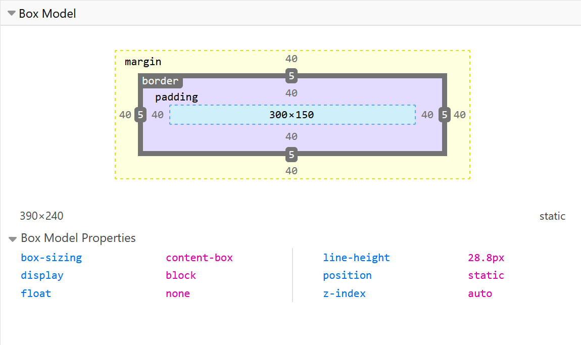
padding: 1.5em 1em 1em 1em sets four different properties in a clockwise fashion: padding-top to 1.5em, then padding-right, padding-bottom, and padding-left to 0.
Now add the following at the bottom of routes/styles.css:
p {  line-height: 1.3;}
header > div,main,footer > div {  max-width: 30rem;  margin: 0 auto;}
The part that describes what elements the rule will select, is called the CSS selector. In the snippet above, p is the first selector. Notice how p selects all HTML p elements.
header > div selects all div elements that are direct children of a header element. Because we want the same styles to also apply to main and the div in the footer, we use a comma-separated selector list containing these three selectors. The newlines after the commas are not necessary, but perhaps make it more readable.
Exceptions to the rule
Section titled “Exceptions to the rule”You’ve seen the power of starting with semantic HTML, and then styling these with CSS element selectors. That’s how you can keep your design consistent. However, sometimes you want to have an exception. That’s what classes are for.
Perhaps you want some, but not all, of your ordered lists to be enumerated with Roman numbers. On line 42 of your HTML file, change your list:
<ol> <ol class="roman"> <li>list item one</li> <li>list item two</li> <li>list item three</li> </ol>And add to your CSS:
.roman > li { list-style-type: upper-roman;}The .roman selects all elements with the class roman. The > li selects all li (list item) elements that are direct children of that element.
We could have also written .roman li, which would select all li nested anywhere inside the element with the class roman. But that can often have unintended side-effects, especially with elements that contains lots of deeply nested children. Thus usually it’s better to stick with the direct child combinator >.
Save your changes
Section titled “Save your changes”Feel free to play around with the CSS. Once you’re happy with the result (or tired of playing around with the design), click the Generate button above the preview. Then don’t forget to save your changes in the Source Control tab.
Inspect your website with your browser’s developer tools
Section titled “Inspect your website with your browser’s developer tools”Often, it can be hard to spot an error in your CSS. Or you’re unsure where some space comes from – is it padding from the outer element, or margin from the inner one? To help you figure out things like that, your browser has built-in developer tools.
Open a new tab in Firefox or Chrome (or in Safari, first check the Show features for web developers checkbox in Preferences -> Advanced). Then once again go to https://your-user-name.github.io/your-repository-name/, where you should see your newest changes reflected.
To open your browser’s developer tools, press the following three keys on your keyboard:
- Windows or Linux:
Ctrl-Shift-I - Mac:
Command-Option-I
A pane should open. If it doesn’t, see the MDN article on how to open your browser’s developer tools.
To inspect an HTML element:
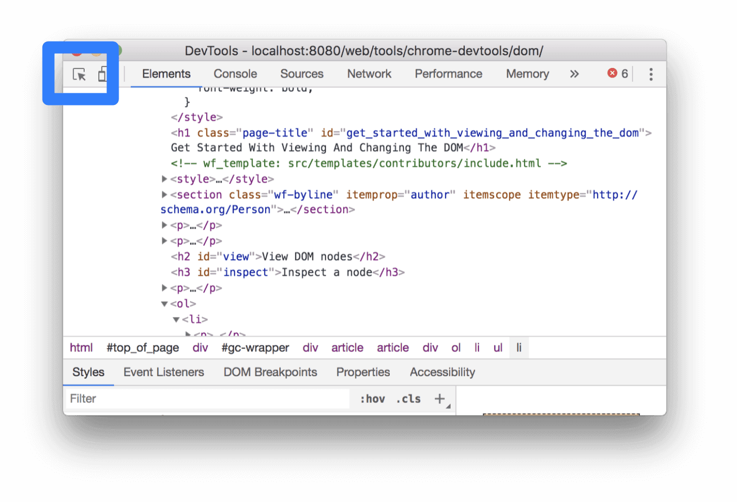
- Click the smallish button in the top left of the newly opened pane. Once clicked, the button should turn blue to signal that it’s active.
- Then click on any element on your website, for example the heading. (Note that before clicking, when you hover over an element, it will show you in bright colors exactly how much space it takes, including its margins and paddings.)
If you weren’t on that tab already, this will switch to the tab called Elements in Chrome, or Inspector in Firefox. And it will highligh the selected HTML element in the document tree, and show which CSS styles are being applied to it on the right (or depending on screen size, on the bottom). You can temporarily edit things there to see how they change, but any changes will be lost after a refresh of the page.
Instead of inspect elements on the generated website, you can also already do so in the Mastro preview pane. However there, the whole VS Code editor is loaded, and the preview is only a small part of the page (inside an iframe). So you’ll have to ignore everything around your part of the HTML, and ignore error messages and warnings that originate from VS Code and its many plugins. I would not recommend starting to learn the developer tools there. But once you get the hang of inspecting HTML and CSS, you can definitely also do it in the Mastro preview.